- Visibility 1.1k Views
- Downloads 412 Downloads
- Permissions
- DOI 10.18231/j.jdp.2021.002
-
CrossMark

Abstract
Forest plot is the graphical display of estimated results from a number of scientific studies included in Meta-Analysis. The name refers to the forest of lines produced. It is also known as a blobbogram and is a graphical representation of data from studies addressing the same question, along with the overall results. It was developed for use in medical research as a means of graphically representing a meta-analysis of the results of randomized controlled trials. One of the foremost advantages of these plots is that one can see and interpret the information from the individual studies that went into meta-analysis at a glance. It also highlights the amount of variation between the studies and an estimate of the overall result. This review article throws a light on the importance of forest plots and their interpretation in the field of dental research.
Introduction
A forest plot is an imperative segment of highly acclaimed scientific articles, the Meta-Analysis. Systematic reviews and meta-analysis of randomized clinical trials are always kept at the top notch position in the pitch of scientific publications. Meta-analysis is the statistical approach for quantitatively combining and synthesizing the results of two or more empirical studies with identical or comparable research questions.[1] In 1976, Glass defined Meta-analysis as the statistical science of analyzing a collection of results from a set of studies with the intention of integrating individual findings.[2] Its principal aim is to critically assess and summarize the available data answering a specific research hypothesis. Meta-analyses may offer more precise conclusions than are available from the component studies; they also have the potential to resolve apparent conflicts in original results by addressing questions not answerable at the level of the individual study, such as the effect of study design or of date or place of research on the estimated effect.[3], [4] In simple words, numerical summaries of the results of multiple studies are known collectively as "meta-analyses". Interpretation of meta-analytic data and results is a complex statistical protocol as it requires evaluation and integration of multitude of statistical information. Hence, meta-analysis data visualization is of prime concern. [1]
Data visualization can be efficiently done using graphs. Graphical display is more effective than tabular and textual format because of many qualities; 1.Effective and appealing to reader, 2. Easily grasped and remembered, 3.Saves time, 4. Provides comprehensive picture of problem 5. Stimulate analytical thinking and investigation.[5] There are varieties of graphs designed and introduced with a purpose of visualizing meta-analysis like forest plots, funnel plots, radial plots etc. And, forest plot is one of the most common and globally accepted graphs used to analyze meta-analysis. Forest plot is a type of graph which presents all the individual studies with results and an overall result in a unique format at one place. These plots can be made by hands or computer. It is also known as a blobbogram, is a graphical representation of data from studies addressing the same question, along with the overall results.[6] Etymologically, the word ‘forest’ means a piece of land with many trees; and the word ‘plot’ means a graphical technique used for representing a data usually as a graph showing relationship between two or more variables. [6], [7] Therefore, in simpler terms, a forest plot is a graphical method used to display the research data with various horizontal and vertical lines.
The forest plot is made up of many horizontal and vertical lines, square shaped and diamond shaped boxes etc. Thus, the name, ‘Forest Plot’ originates from the idea that the typical plot appears as a ‘forest of lines’.1At the September 1990 meeting of the breast cancer overview, Richard Peto jokingly mentioned that the plot was named after the breast cancer researcher Pat Forrest, and at times, the name has been spelt,”forrest plot”.[8] In 1996, a review on nursing interventions for pain claims its name first use in print form. An abstract at the Cochrane colloquium in the same year also used this name.[9]
This literature review is a genuine attempt to provide readers the elusive knowledge of studying and interpreting forest plots used in meta-analysis.
Definition of forest plot
Forest plot is a graphical display of estimated results from a number of scientific studies included in Meta-Analysis.[2]
Rationale of using forest plot:[10]
To provide information from the individual studies used in meta-analysis at a glance
To provide a simple visual representation
History
The history of graphical representation of data in the field of research is more than 200 years old. In 1801, one of the fathers of statistical graphics, William Playfair, mentioned that graphs make the statistical data more palatable. He introduced bar chart, pie chart and circle graph in his “Commercial and Political Axis in 1786” and “The Statistical Breviary in 1801”.5 The rapid spread of the use of computers for statistical analysis in the early 1960’s lead to an upsurge in work involving multivariate analysis. This in turn, led to various proposals for representing multidimensional data in only two dimensions. One plot is shown in a 1985 book about meta-analysis. The first use in print of the expression "forest plot" may be in an abstract for a poster at the Pittsburgh (US) meeting of the Society for Clinical Trials in May 1996.The world of graphical display has a come a long way from bar charts to forest plots, funnel plots, P-P plots etc. [5]
The Forest plots are one of the widely used graphs in analyzing the meta-analysis nowadays. Freiman et al [11] displayed the results of several studies with horizontal lines showing the confidence interval for each study and a mark to show the point estimate. This study was not a metaanalysis, and the results of the individual studies were therefore not combined into an overall result. In 1982, Lewis and Ellis [12] produced a similar plot but this time for a metaanalysis, and they put the overall effect on the bottom of the plot. However, smaller studies, with less precise estimates of effect, had larger confidence intervals and were the most noticeable on the plots. So, a replacement was needed to highlight larger studies with smaller confidence intervals. In 1983, Stephen Evans at a Royal Statistical Society medical section meeting at the London School of Hygiene and Tropical Medicine replace the mark with a square whose size was proportional to the precision of the estimate. He based the idea on modified box plots.[13], [14], [15] The first metaanalysis to include squares of different sizes to show the positions of the point estimates were probably those produced by the Clinical Trial Service Unit in Oxford in the 1998 overview of the prevention of vascular disease by antiplatelet therapy. The area of each square was proportional to the weight that the individual study contributed to the metaanalysis. [16]
An elusive example is the logo of Cochrane collaboration which represents a typical forest plot. The circle formed by two 'C' shapes represents global collaboration. The lines within illustrate the summary results from an iconic systematic review. Each horizontal line represents the results of one study, while the diamond represents the combined result, estimate of whether the treatment is effective or harmful. The diamond sits clearly to the left of the vertical line representing "no difference", therefore the evidence indicates that the treatment is beneficial. This forest plot illustrates an example of the potential for systematic reviews to improve health care. It shows that corticosteroids given to women who are about to give birth prematurely can save the life of the newborn child. This simple intervention has probably saved thousands of premature babies. After a systematic review made the evidence better-known, the treatment was used more, preventing thousands of pre-term babies from dying of infant respiratory distress syndrome. [17]
Schematic representation of forest plot:[6]
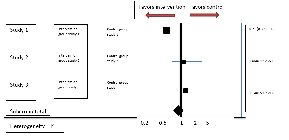
|
Trait |
Number |
|
1. Columns |
4: 3 left hand columns; 1. presenting studies with authors and year, 2nd and 3rd columns are for study and control groups. 1 right hand column presenting the Odds ratio |
|
2. Vertical line |
2: Solid vertical line presenting line of null effect. Dashed vertical line presenting overall meta-analyzed effect |
|
3. Horizontal line |
1 long and Multiple short lines: Long line at the base represents statistics at linear or log scale representing standardized mean difference or Odds ratio. Short lines: Each horizontal line presents results of individual studies with 95% confidence intervals at both ends of horizontal line. Larger the line, less effective is the study. Shorter the line, more effective is the study |
|
4. Boxes |
2 Boxes of square and diamond shapes: Square- presents each study weight Diamond- meta-analyzed weight Larger the size of box, more is the sample size, more is the weight of the study. Smaller the size ofbox, less is the sample size, less is the weight of study. |
There are two columns in a forest plot, left and right to the line of null effect. The left-hand column lists the names of the studies included in meta-analysis, frequently randomized controlled trials or epidemiological studies, commonly in chronological order from the top downwards. There are other columns on left side which includes study group column and control group column. The right-hand column is a plot of the measure of effect like an odds ratio for each of these studies including confidence intervals represented by horizontal lines. Horizontal line at the base represents statistics at linear or log scale representing absolute statistics like standardized mean difference or relative statistics like Odds ratio. If it represents Odds ratio, the vertical line of null effect meet the horizontal line at 1, as the null difference value for relative statistics is 1; whereas if it represents Standardized mean difference the vertical line of null effect meet the horizontal line at 0, as the null difference value for absolute statistics is 0. The forest plot is usually plotted on a natural logarithmic scale using odds ratios, so that the confidence intervals are symmetrical about the means from each study; and to ensure that undue emphasis is not given to odds ratios greater than 1 when compared to those less than 1. Vertical line of no effect represents odd ratio of 1 and is plotted as a solid line. The overall meta-analyzed measure of effect is often plotted as a dashed vertical line. Each study row shows a horizontal line representing point estimate and 95% confidence interval for each individual study. The area of each box is proportional to the study's weight or sample size of the study in the meta-analysis. More the sample size more is the size of box and less would be the length of horizontal line. Each individual study weight is represented by a square box. The meta-analyzed measure of effect is commonly plotted as a diamond, whose center indicates the magnitude of the effect and the lateral points of which indicate confidence intervals for this estimate. If the confidence intervals for individual studies overlap with the line of null effect, it demonstrates that their effect sizes do not differ from no effect for the individual study and results are non-significant; the same applies for the meta-analysed measure of effect. If the points of the diamond overlap the line of no effect, the overall meta-analysed result cannot be said to differ from no effect at the given level of confidence and the meta-analysed result is non-significant.([Table 1], [Table 2])
Key features:[1]
Illustration of summary of all studies
Illustration of study level effects
Illustration of interval estimates (i.e. estimating a parameter using a range of values rather than a single number).
Clear labeling of each study
Illustration of large picture showing minute details, small interactions and significant subset effects.
|
Characteristics: |
Interpretation |
||
Studies |
Studies included in the meta-analysis are incorporated into the forest plot will generally be identified in chronological order on the left hand side by author and date. There is no significance given to the vertical position assumed by a particular study. |
||
Odds ratio |
An odds ratio (OR) is a measure of association between an exposure and an outcome. The OR represents the odds that an outcome will occur given a particular exposure, compared to the odds of the outcome occurring in the absence of that exposure. The odds ratio can also be used to determine whether a particular exposure is a risk factor for a particular outcome, and to compare the magnitude of various risk factors for that outcome. OR=1 Exposure does not affect odds of outcome OR>1 Exposure associated with higher odds of outcome OR<1 Exposure associated with lower odds of outcome Calculation of Odds Ratio:= a x d / b x c |
||
|
Early Childhood Caries |
No Early Childhood Caries |
Total (N) |
|
|
Tooth brushing |
a-20 |
b-80 |
(m) 100 |
|
No tooth brushing |
c-70 |
d-30 |
(n) 100 |
|
OR= 20 X 30/ 80 X 70 = 600/ 5600= 0.107 Odds Ratio can be plotted on a linear or log scale. However, the preferable one is log scale because the values of odds ratio are reciprocal and equidistant from 1, since they represent ratio of same magnitude but opposite direction. This chart portion of the forest plot will be on the right hand side and will indicate the mean difference in effect between the test and control groups in the studies. A more precise data shows up in number form in the text of each line; the horizontal distance of a box from the vertical line of null effect demonstrates the difference between the test and control group values. |
|||
Confidence interval |
A Confidence Interval is a range of values we are fairly confident our true value lies in. And 95 % confidence interval means that we are confident that 95 out of 100 times the estimate will fall between the upper and lower values specified by the confidence interval. The 95% confidence interval (CI) is used to estimate the precision of the Odds Ratio. A large CI indicates a low level of precision of the OR, whereas a small CI indicates a higher precision of the OR. The thin horizontal lines—sometimes referred to as whiskers—emerging from the box indicate the magnitude of the confidence interval. The longer the lines, the wider the confidence interval, and the less reliable the data. The shorter the lines, the narrower the confidence interval and the more reliable the data. If either the box or the confidence interval whiskers pass through the line of no effect, the study data is said to be statistically insignificant. Confidence intervals are calculated using the formula shown below Upper 95% CI=e^[ln (OR)+1.96√ (1/a+1/b+1/c+1/d)] Lower 95% CI=e^[ln (OR)−1.96√ (1/a+1/b+1/c+1/d)] |
||
Weight |
The meaningfulness of the study data, or power, is indicated by the weight or size of the box. More meaningful data, such as those from studies with greater sample sizes and smaller confidence intervals, is indicated by a larger sized box than data from less meaningful studies, and they contribute to the pooled result to a greater degree. |
||
Heterogeneity |
In general, heterogeneity means difference in samples, results etc. Heterogeneity in meta-analysis refers to the variation in study outcomes between studies. The forest plot is able to demonstrate the degree to which horizontal lines from multiple studies observing the same effect, overlap with one another. Results that fail to overlap well are termed heterogeneous and referred to as the heterogeneity of the data—such data is less conclusive. If the results are similar between various studies, the data is said to be homogeneous, and the tendency is for these data to be more conclusive. It can also be calculated by statistical science. The chi square test is included in forest plots to determine heterogeneity. The heterogeneity is indicated by the I2. The I2 statistic describes the percentage of variation across studies is due to heterogeneity rather than chance. Heterogeneity of less than 25% is termed low, and indicates a greater degree of similarity between study data than an I2 value above 50%, which indicates more dissimilarity. |
Limitations of forest plots:[19]
Small studies have long confidence intervals, they might attract more visual attention than large subgroups and vice versa. This might lead to an interpretational bias toward potentially questionable small study effects.
Individual point estimates of large studies are difficult to differentiate because of plotting the size of the squares in proportion to the study's weight in the analysis.
Viewers may consider that all points within the interval are probably equal. They overlook the fact that values within the individual confidence interval decreases as they move toward the outer boundaries of the interval. This assumption may impact every aspect of the interpretation of the plot, especially with regard to differences between individual studies and between study heterogeneity.
Types
Caterpillar plot
The caterpillar plot, individual studies are sorted in order of increasing effect size and not in a chronological sequence. This graph clearly illustrates heterogeneity better than forest plots. This type of modification to a forest plot can be especially helpful when the number of included individual studies is large. The disadvantage is that individual studies cannot be studied by authors name or year. Many meta-analytical researches use a forest plot aiming to make the individual point estimates and studies fully apparent, rather than assessing the pattern of point estimates across all the included studies, and the software recommended by Cochrane collaboration (i.e., RevMan) for producing forest plot cannot produce a caterpillar plot. [20]
Subgroup forest plot
The subgroup forest plot, individual studies are sorted in different subgroups and statistically analysed and then all the analysed results of different subgroups are meta-analysed. Two types of error can occur. The most well-known is to attribute an effect to a subgroup when there is no overall effect and no evidence for heterogeneity. Less well appreciated is to claim a lack of effect in a subgroup when the overall effect is significant. Confidence intervals in subgroups are always wider than those for the main effect because of smaller numbers. If the interval for a subgroup crosses the no effect point, this is widely misinterpreted as a lack of effect in the subgroup even where the overall effect is significant. The correct approach is to test for heterogeneity. [21]
Summary forest plot
The summary forest plot, shows and compare additional or exclusive summary estimates of groups of studies. [22]
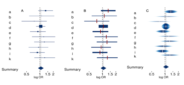
Rainforest plot
In rainforest plots, the confidence interval is marked by a horizontal white line, and its width corresponds to the width of the raindrop. In addition, the uncertainty is represented by both the height of the raindrop and the shading. The individual effect is clearly marked by a white tick mark and can be discerned regardless of the sample size of the subgroup. The height of the raindrop corresponds to the likelihood of each value within the confidence interval and in studies with larger sample sizes, it draws the viewer’s attention with its thicker raindrop and darker color as well as higher saturation. [23]
Thick forest plot
In this type of graphical display, confidence interval is drawn with line width proportional to study weight. It resolves two glitches of forest plots: (1) Visual attention of smaller studies because of the length of their confidence intervals and (2) individual effects of studies with large weights may be hard to distinguish because of the size of the boxes. In this type of graph, the line width of the confidence intervals of the individual studies is proportional to the weight assigned to the study in the meta‐analysis to rectify the potential problem that small studies receive an undue amount of visual attention. Furthermore, individual effect estimates were clearly marked with red ticks, which are of the same thickness and length for all included studies. That is, this type of display largely corresponds to the conventional forest plot, but the line width of the confidence intervals varies with the assigned weights. [24], [25]
Conclusion
The knowledge of Forest plot is very much essential for a researcher
Forests plots forms an invincible segment of meta-analysis
The article intended to help medical and dental fraternities in analyzing and interpreting forest plots.
Conflicts of Interest
All contributing authors declare no conflicts of interest.
Source of Funding
None.
References
- . Wikipedia, the free encyclopedia. Forest plot [Internet]; [updated 2021; cited 2021 May 15]. Wikipedia, the free encyclopedia. . [Google Scholar]
- Cantley N. Tutorial: How to read a forest plot [Internet]. [updated 2016; cited 2021 May 12]. . 2016. [Google Scholar]
- Szumilas M. Explaining odds ratio. J Can Acad Child Adolesc Psychiatry. 2010;19(3):227-9. [Google Scholar]
- . Cochrane. Our logo tells a story [Internet]; [cited 2021 May 3]. . . [Google Scholar]
- Lewis S, Clarke M. Forest plots: trying to see the wood and the trees. BMJ. 2001;322(7300):1479-80. [Google Scholar]
- GLASS GV. Primary, Secondary, and Meta-Analysis of Research. Educational Researcher. 1976;5(10):3-8. [Google Scholar] [Crossref]
- Louis T, Fineberg H, FM. Findings for public health from meta-analysis. Ann Rev Public Health. 1985;6:1-20. [Google Scholar]
- SG. Quantitative methods in the review of epidemiologic literature. Epidemiol Rev . 1987;9(1):1-30. [Google Scholar] [Crossref]
- Fienberg SE. Graphical methods in statistics. Am Stat. 1979;33(4):165-78. [Google Scholar]
- Sindhu F. Are non-pharmacological nursing interventions for the management of pain effective? - A meta-analysis*. J Adv Nurs. 1996;24(6):1152-9. [Google Scholar] [Crossref]
- Bijnens L, Collette L, Ivanov A, Hoctinboes G, Sylvester R. Oxford: Cochrane Collaboration; 1996. Optimal graphical display of the results of meta-analyses of individual patient data. Proceedings of the 4th Cochrane colloquium. 1996. [Google Scholar]
- . Cochrane Collaboration.Cochrane Library. Issue 1. Oxford: Update Software. . 2001. [Google Scholar]
- Freiman J, Chalmers T, Smith H, Kuebler R. The Importance of Beta, the Type II Error and Sample Size in the Design and Interpretation of the Randomized Control Trial. N Engl J Med. 1978;299(13):690-4. [Google Scholar] [Crossref]
- Lewis J, Ellis S. A statistical appraisal of post-infarction beta-blocker trials. Prim Cardiol. 1982. [Google Scholar]
- Mcgill R, Tukey JW, Larsen WA. Variations of box plots. Am Stat. 1978;32:12-6. [Google Scholar]
- Demets DL. Methods for combining randomized clinical trials: Strengths and limitations. Stat Med. 1987;6(3):341-50. [Google Scholar] [Crossref]
- Galbraith R. A note on graphical presentation of estimated odds ratios from several clinical trials. Stat Med. 1988;7(8):889-94. [Google Scholar] [Crossref]
- . Antiplatelet Trialists' Collaboration.Secondary prevention of vascular disease by prolonged antiplatelet treatment. BMJ. 1988;296:320-31. [Google Scholar]
- Schild A, Voracek M. Finding your way out of the forest without a trail of bread crumbs: development and evaluation of two novel displays of forest plots. Res Syn Meth. 2015;6(1):74-86. [Google Scholar] [Crossref]
- Hurley J. Forrest plots or caterpillar plots?. J Clin Epidemiol. 2020;121:109-10. [Google Scholar] [Crossref]
- Cuzick J. Forest plots and the interpretation of subgroups. Lancet. 2005;365(9467). [Google Scholar] [Crossref]
- Kossmeier M, Tran US, Voracek M. Charting the landscape of graphical displays for meta-analysis and systematic reviews: a comprehensive review, taxonomy, and feature analysis. BMC Med Res Methodol. 2020;20(1):1-24. [Google Scholar] [Crossref]
- Zhang Z, Kossmeier M, Tran U, Voracek M, Zhang H. Rainforest plots for the presentation of patient-subgroup analysis in clinical trials. Ann Transl Med. 2017;5(24). [Google Scholar] [Crossref]
- Walker A, Martin-Moreno J, Artalejo F. Odd man out: a graphical approach to meta-analysis.. Am J Public Health . 1988;78(8):961-6. [Google Scholar] [Crossref]
- Li G, Zeng J, Tian J, Levine M, Thabane L. Multiple uses of forest plots in presenting analysis results in health research: A Tutorial. J Clin Epidemiol. 2020;117:89-98. [Google Scholar] [Crossref]